Piazza Ed-Tech Platform
Design Sprint
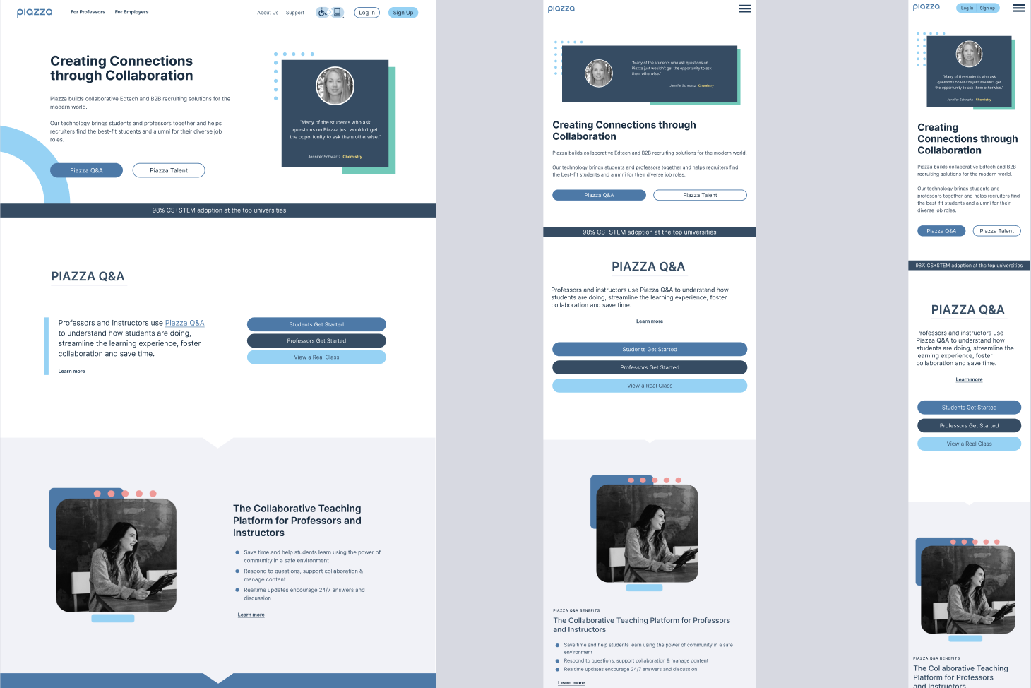
A design sprint to modernize a university ed-tech platform that wasn’t working — visually or functionally.
My role: UX/UI Design, Design Workshop Facilitation, Visual Direction, Developer Handoff
The Problem
Piazza is a widely-used ed-tech platform connecting students and instructors. Despite strong utility, the product suffered from an outdated visual design and a website that wasn’t keeping pace with modern UX standards — creating friction for users and undermining trust in the brand.
The ask: lead a focused design sprint to align stakeholders, define a clear visual direction, and produce responsive designs ready for developer handoff.
Starting Point
The existing site had usability and aesthetic issues that stakeholders knew needed addressing — but hadn’t yet aligned on what “better” looked like. Before design work could begin, we needed to surface those opinions and build consensus around a shared vision.
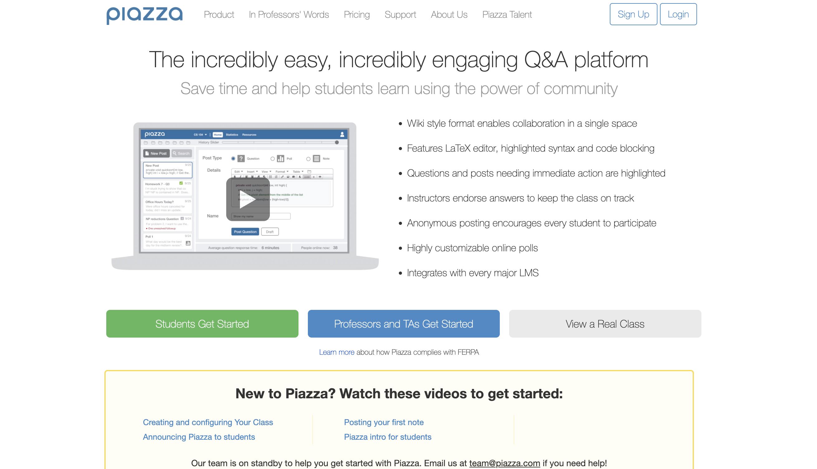
Design Sprint Process
1 — Lead a Remote Design Workshop
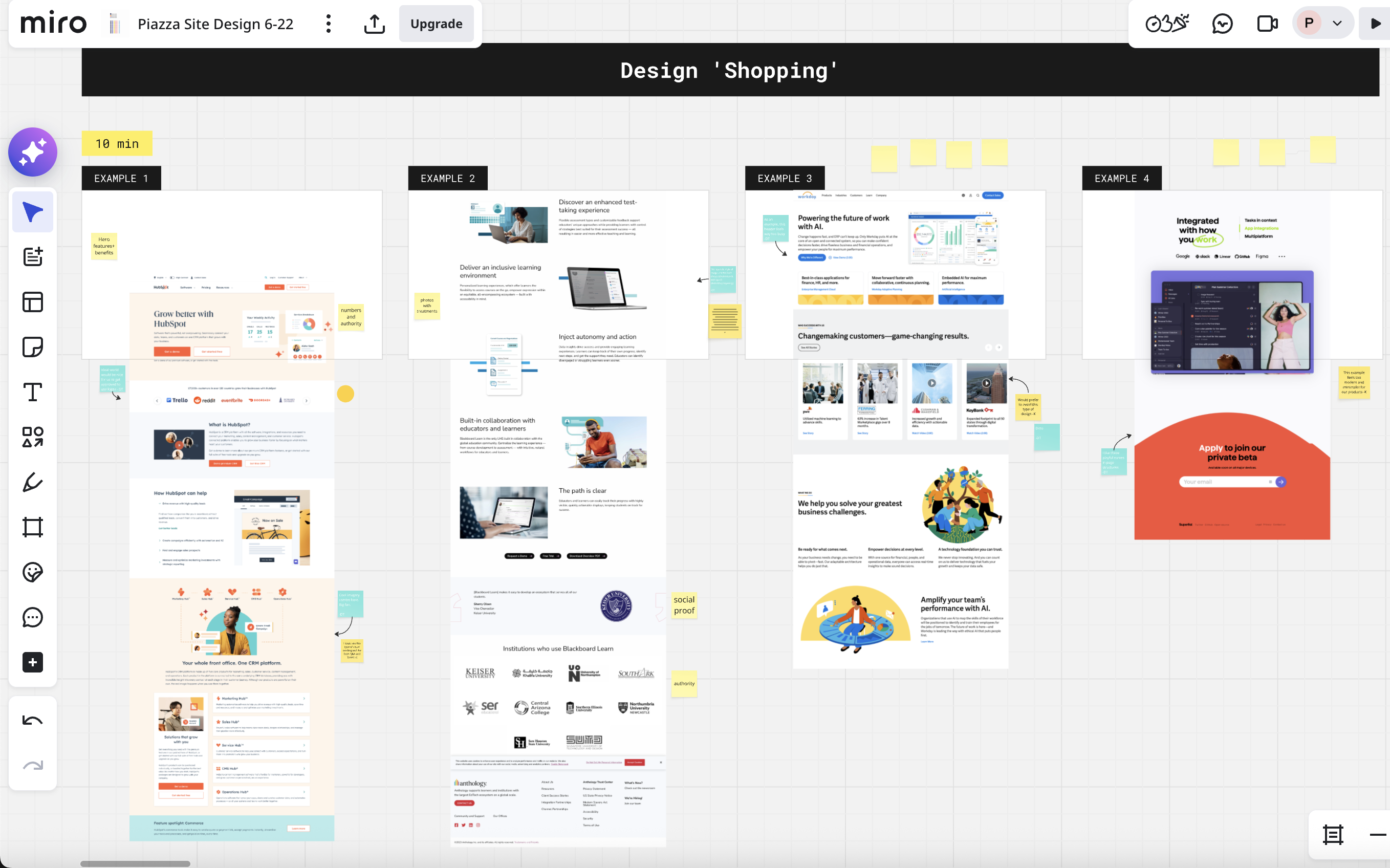
I facilitated a remote workshop with stakeholders using Miro, combining sticky note exercises and visual slider exercises to draw out honest reactions to existing designs.
Key question: “What do you like and dislike about these page designs?”
This surfaced real opinions quickly and gave everyone a shared vocabulary for what wasn’t working — and what to aim for.
2 — Gather and Align Design Visions
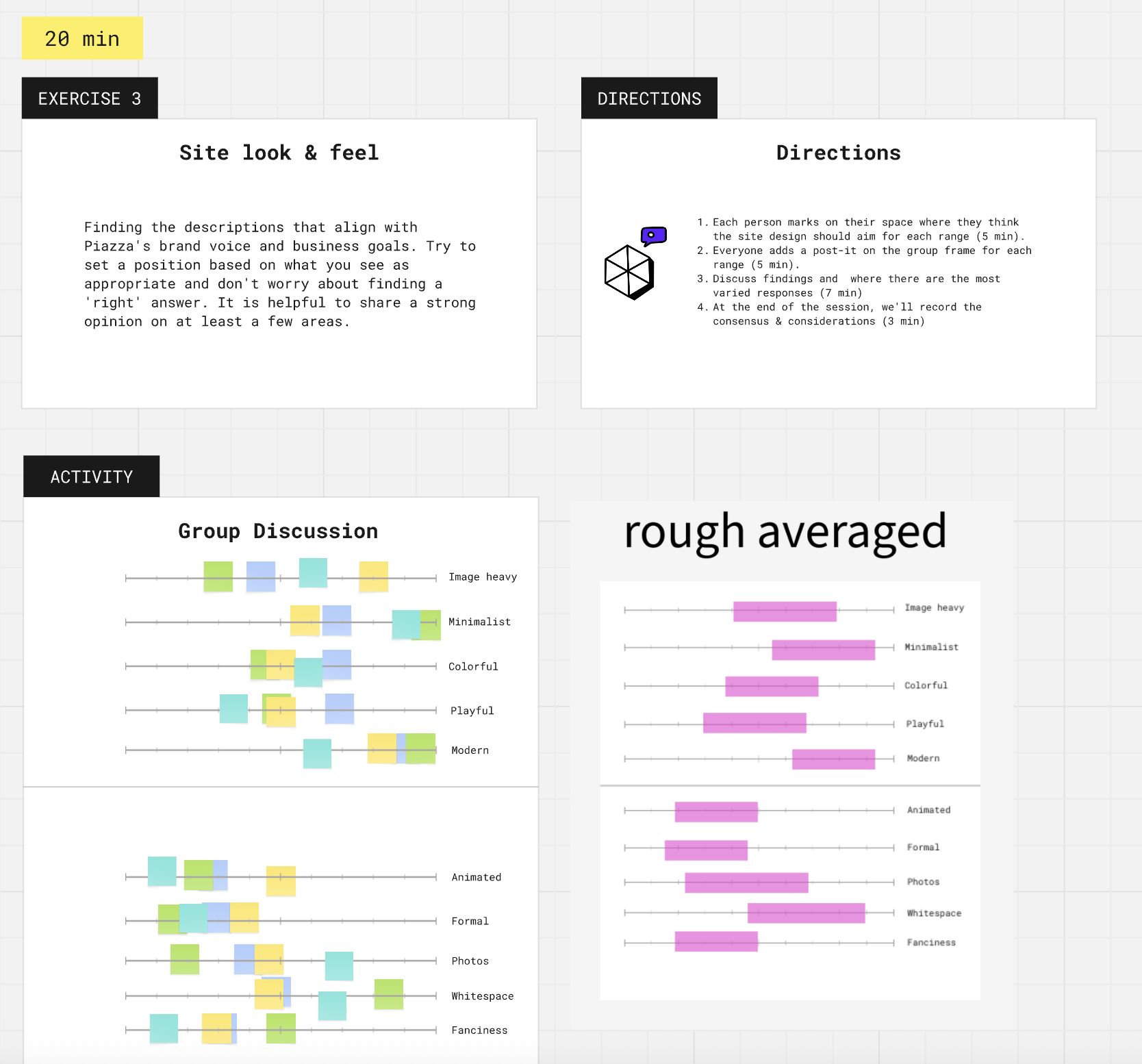
With reactions on the table, I moved into alignment exercises to understand how stakeholders imagined the redesigned site. Slider exercises helped translate subjective preferences — minimal vs. bold, clean vs. expressive — into actionable design parameters.
Key question: “How do you imagine the redesigned website?”
3 — Present Three Visual Directions
From the workshop findings I developed three distinct visual directions, each exploring a different design language within the established constraints. Presenting multiple directions early — even at high fidelity — lets clients experience real options rather than reacting abstractly.
The outcome was a hybrid direction: taking the strongest elements from each concept and combining them into a unified approach.
Note: this kind of early high-fidelity work is more effort upfront, but it builds stakeholder confidence and dramatically reduces revision cycles later.
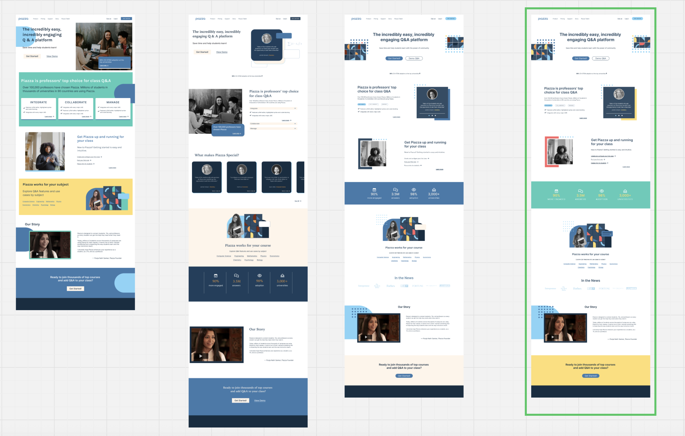
4 — Design Responsive Screens & Components for Handoff
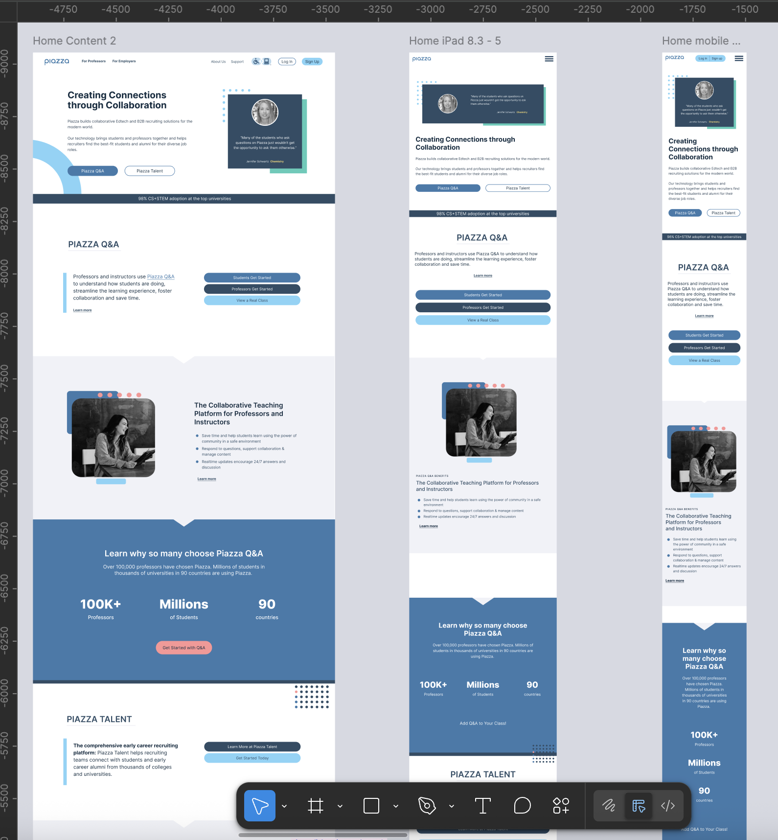
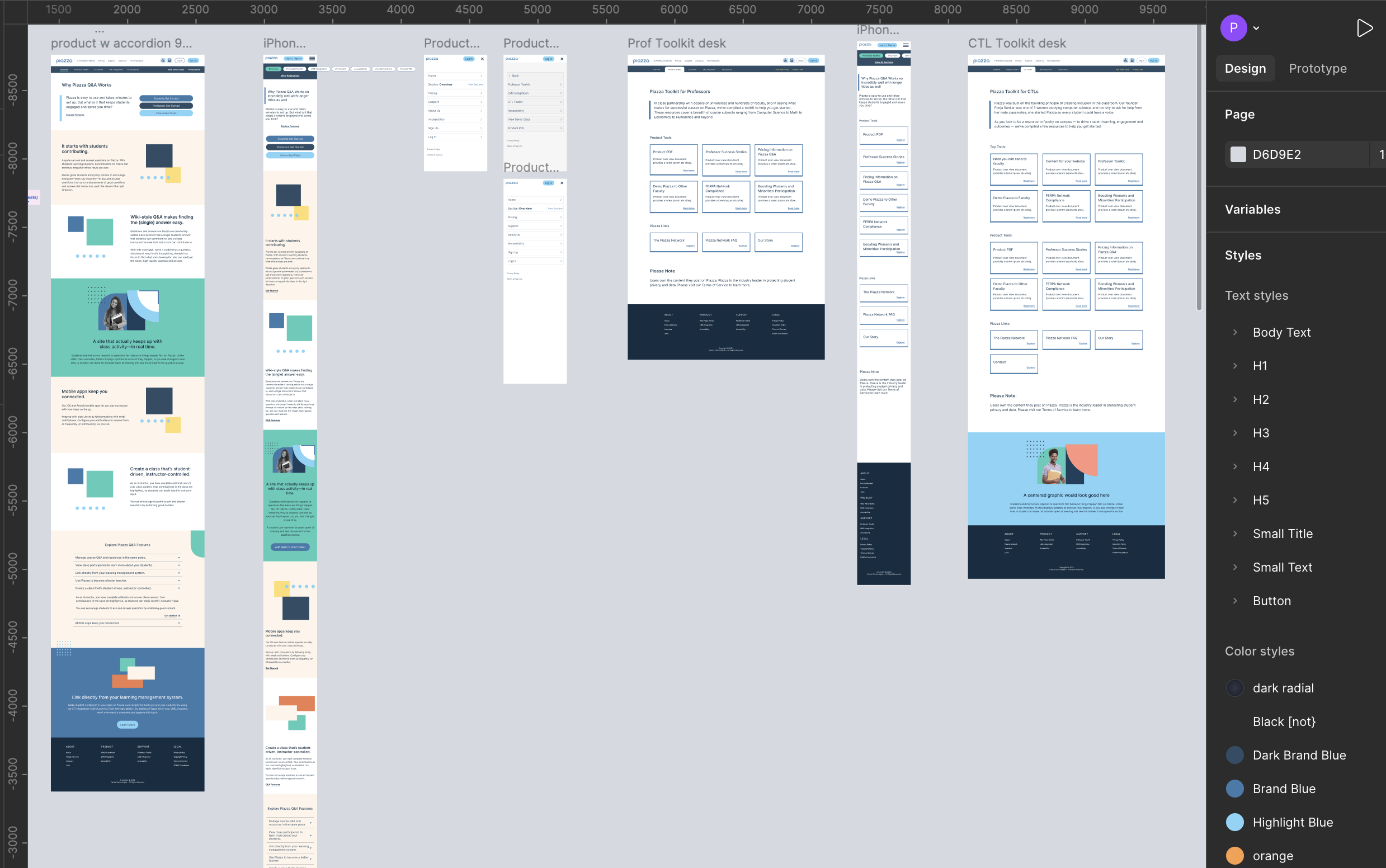
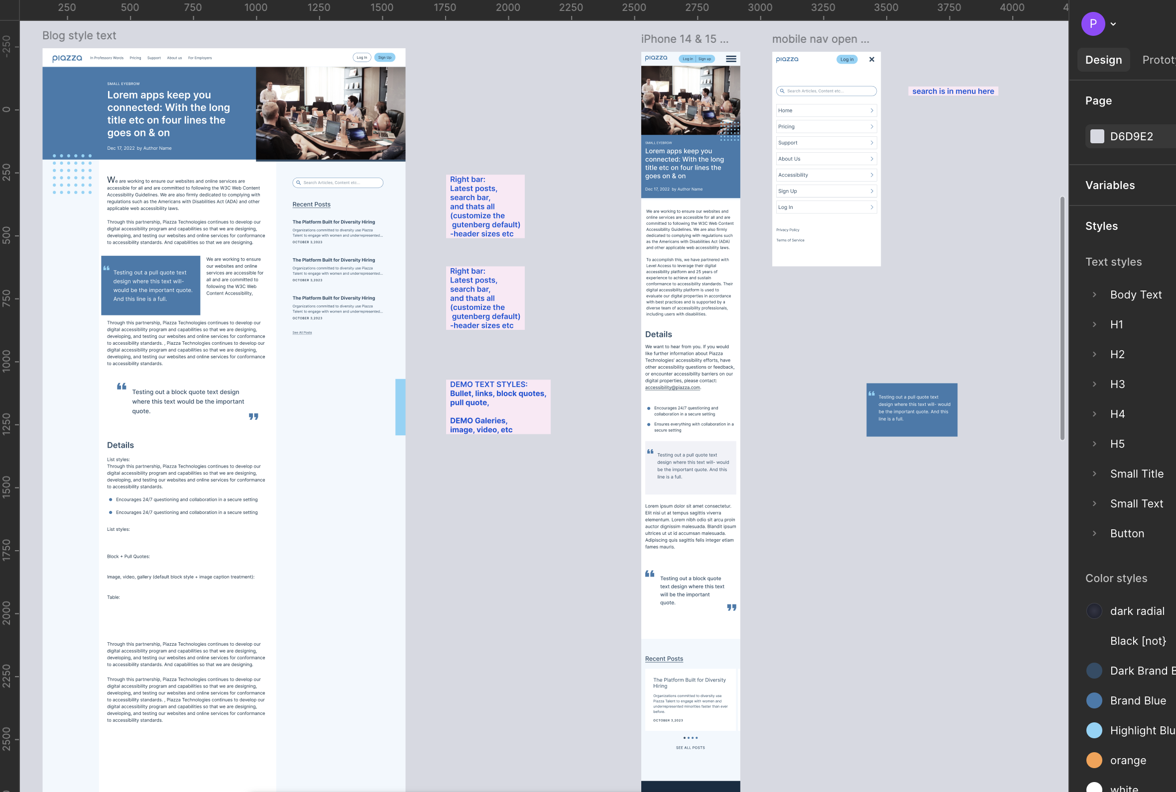
With a clear direction locked, I designed the full site — homepage, product portal, and blog section — at responsive breakpoints, with a complete component library for developer handoff.
Home Page
Product Portal
Blog Section
Takeaways
The design sprint format worked well here — structured enough to move fast, flexible enough to surface the real stakeholder needs that would have taken weeks to uncover through a traditional process. Getting alignment before designing saved significant rework and gave the final designs a clear rationale everyone had participated in building.