FortyToo Design System
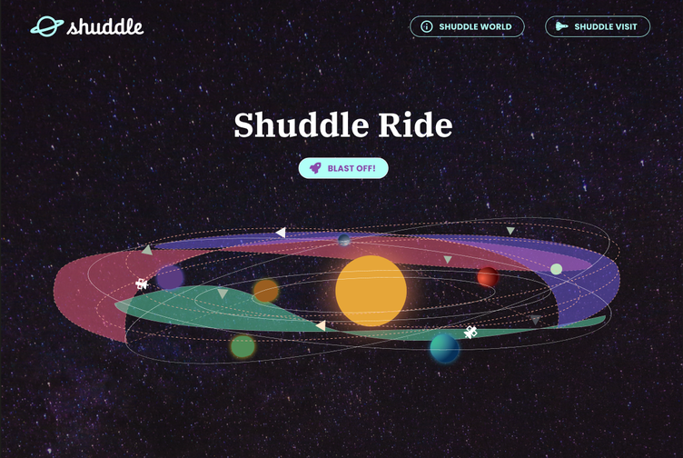
Design System for Space Travel + Re-brand (Class Project)
My role:
- Creating design system assets
- Documenting the system (in Zeroheight)
- Demonstrating the system with product comps
- Testing the system with rebranding
- Implementing Tokens Studio in Figma
This project’s aim was to create a design system to support three different pages for a fictional space travel company. I completed this work for Dan Mall’s Dribbble class: Scaling Design Systems.
The design systems approach is all about solving problems of consistency, repetition and over-complication that arise when working on multiple digital products under a single brand identity.
Developing the system in Figma while designing the 3 related products provided an opportunity to identify and codify patterns for reusable components and apply them to the design process.

The Design System 'fortyToo'
The system needed to be developed in conjunction with three core products. These three products were described in the project assignment:
- ipts.org, an informational website with news and updates.
- IPTS Travel, a website where you can browse and book travel to and from multiple destinations within our galaxy.
- IPTS Rail, a real-time updated web app where you can view lines, routes, and times for commuter lines.
Approach
Designing the three products while contributing components to the system had a few notable impacts on my approach. A design system is meant to simplify and speed up product design but it requires an up-front investment of time.
The tricky part was designing all three products at once (to some extent) so that patterns could be identified, built out and contributed to the system as early as possible.
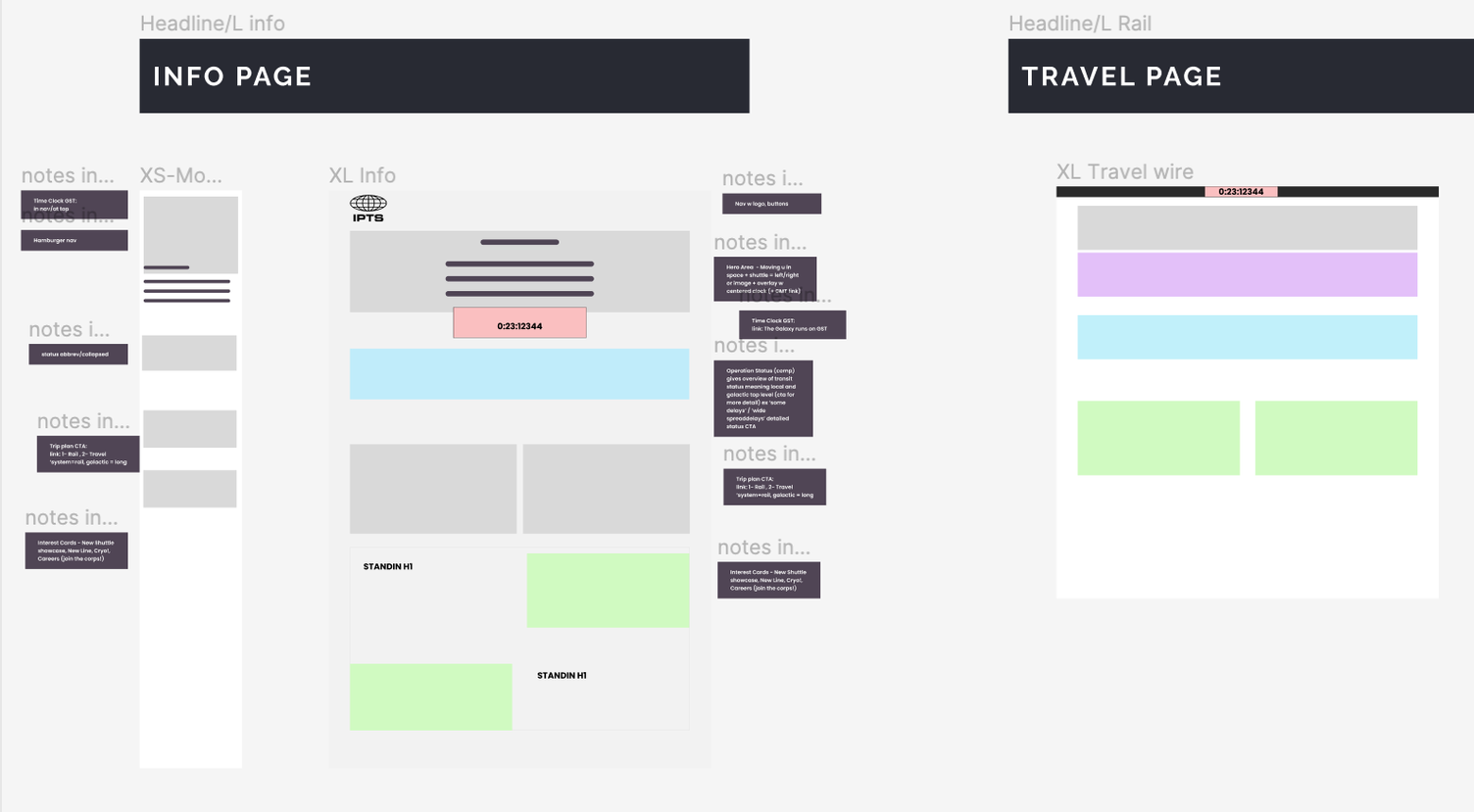
I started with low fidelity wires of all three pages, identified areas where components could take on multiple roles, and carried out the brand design, system foundations work, and component building simultaneously.
Designing
Stage one: Low fidelity wireframes and color coding to identify patterns.
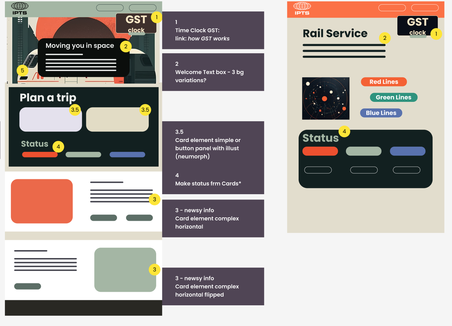
Stage two: Higher fidelity wireframing: exploring look and feel ideas & component design options
Styles + Components
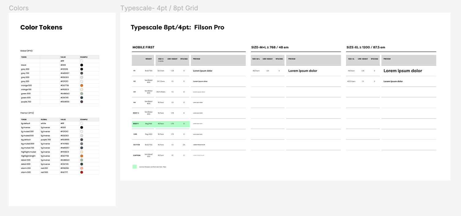
Building the products and the components together was a little like rolling a boulder down a hill. It was slower at first with stopping, re-thinking, re-working and then it sped up as patterns solidified and the system approach showed it’s benefits. Like any product design, defining colors and type styles early on was important.
I used Token Studio in Figma for color styles to test out the workflow of generating JSON from Figma. Future updates will include tokenizing type styles and I’m excited to start generating CSS that connects all the way back to the definitions in Figma.
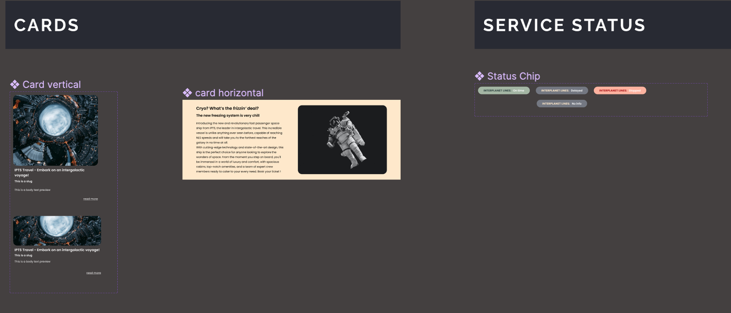
Products + IPTS Brand
The three pages feature repeated elements with variations. Figma’s component properties make this simple and straight-forward.
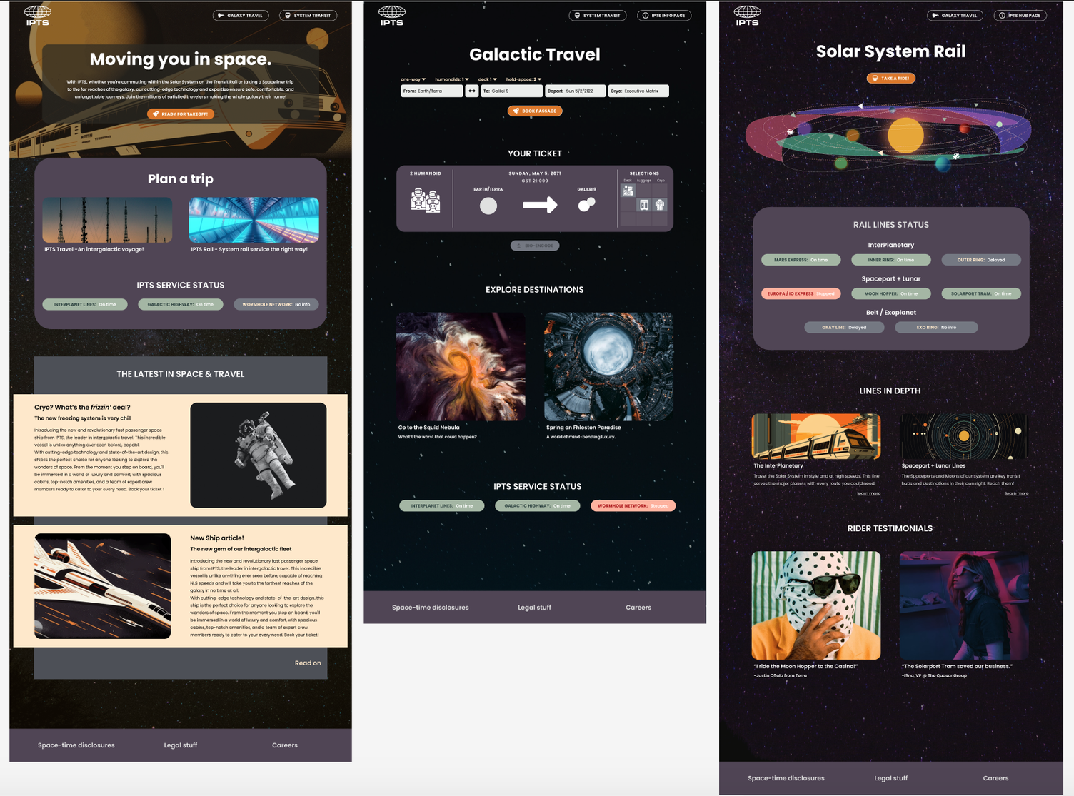
The IPTS brand is friendly and a little retro, like many transit systems. It is modernizing in stages with some chunkier elements and retro-futurism carrying through, especially on the organization page.
The customizable cards, the hero and the two versions of the service status organism cover much of the repeated page content.
The trip planner, ticket preview and Solar Rail map are the one-off elements. Horizontal cards ended up getting less use in the final design.
The final design was a little more modern than initial prototypes as I moved from a retro, card stock inspired background texture to a night sky.
Rebranding as Shuddle
The Shuddle branding called for an overhaul of most of the elements.
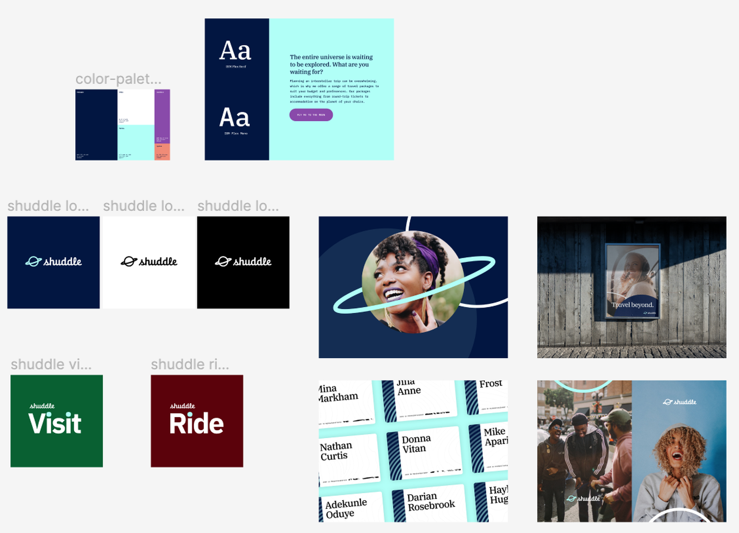
Starting with styles, the first question was how the tokenized color library would work during a branding change. I added the new colors as global tokens then defined a new Shuddle brand token set.
This was where things got tricky. How to switch over the token set without re-applying everything? I decided to change the references in the existing IPTS-branded token set instead of switching over to a new token set.
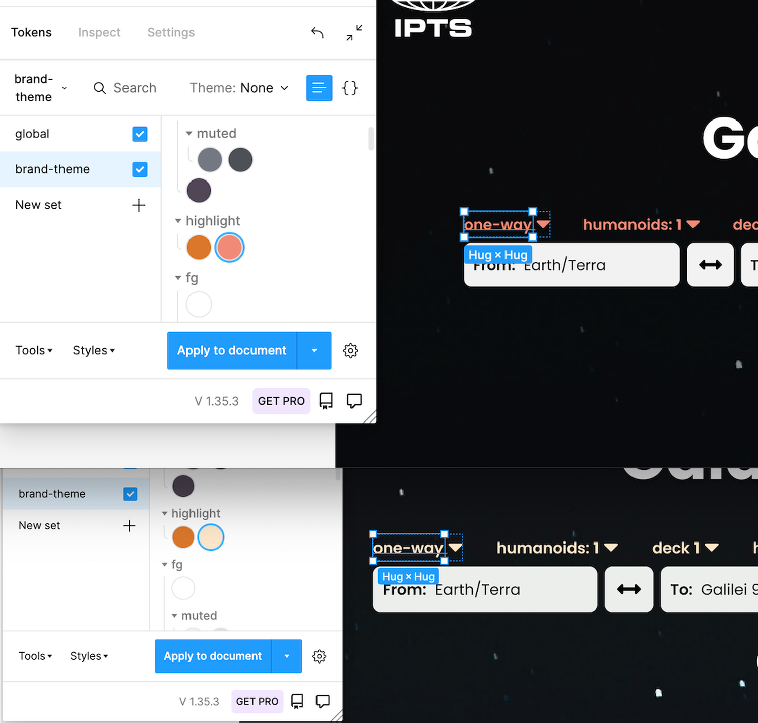
Updating the brand token set worked but I’m curious about other approaches. I’ll look into this more as I continue to work with Tokens Studio.
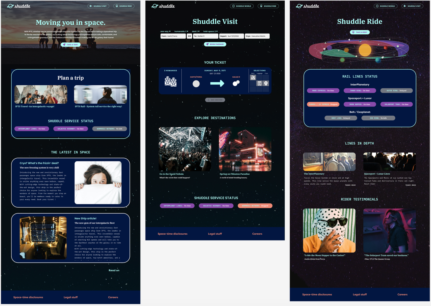
Welcome to Shuddle! The new branding meant an updated release of the fortyToo design system–version 1.2.0
System Documentation
This design system is documented with a reference page in zeroheight, which is a great tool for design systems. Among its many impressive features is the option to integrate Figma files and support for React/Storybook.
Results + Takeaways
This was a rapid experiment in applying the main principles of design systems to demonstrate value and the main areas of success were where it saved time in working on multiple products and rebranding.
A few main takeaways from this project:
- Figma rewards working from a well-established foundation so setting type styles, colors and components early pays off later, especially when growing/implementing a design system.
- Coming up with an entire brand look and feel, even when it’s fictional, takes a surprising amount of time so setting constraints (as a client or organization would bring) is helpful in personal projects.
- Useful design system documentation doesn’t just catalog the components in the system, it shows you how to use them.